Baylor Scott
& White
Client
Baylor Scott & White Health | Healthcare, Texas (USA) · via Jüssi Intention Marketing
Designing with
Product
Engineering
Marketing
Growth
My role
User research, UI/UX design, information architecture, prototyping and testing
Date
2021

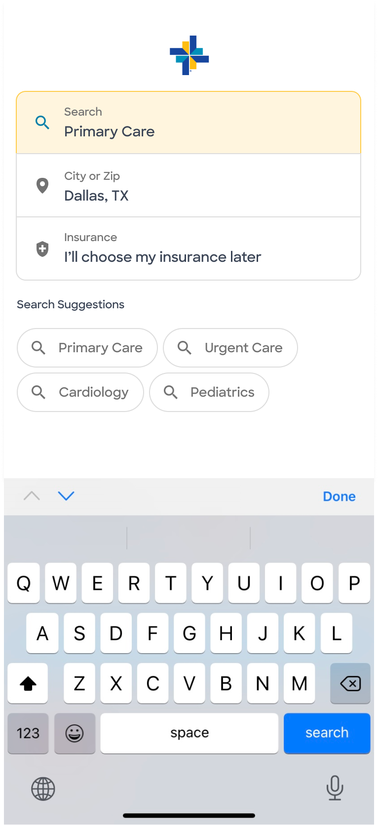
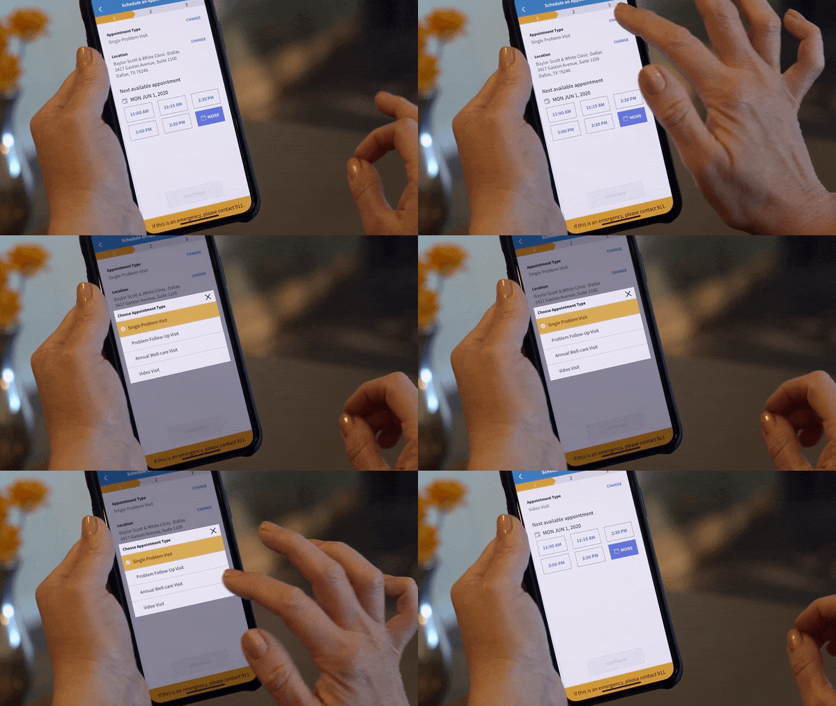
Scheduling an appointment on mobile.

The challenge

A digital front door for 6.6M patient encounters a year

Baylor Scott & White Health is the largest non-profit healthcare system in Texas. Its digital team found that significant resources went into customer support for record checks, finding the right doctor, paying bills and insurance questions. Under Medicare guidelines, hospitals are paid on population outcomes, patient satisfaction and overall cost, so a better digital front door had a direct revenue impact.

6.6Mpatient encounters a year
48hospitals in the network
7,800active physicians
42%of patients would switch doctors over a poor digital experience (Forrester, 2020)dos pacientes trocariam de médico por causa de uma experiência digital ruim (Forrester, 2020)
ContextA public website with many page types (locations, providers, services) designed to inform rather than to help people act.Um site público com muitos tipos de página (unidades, médicos, serviços), feito para informar e não para ajudar as pessoas a agir.
ProblemPatients turned to support for tasks the website should solve (find a doctor, book, pay), which consumed significant resources.
My roleUser research, UI/UX design, information architecture, prototyping and testing, working with Product, Engineering, Marketing and Growth.
01 · Diverge

Understanding the ecosystem before redesigning it
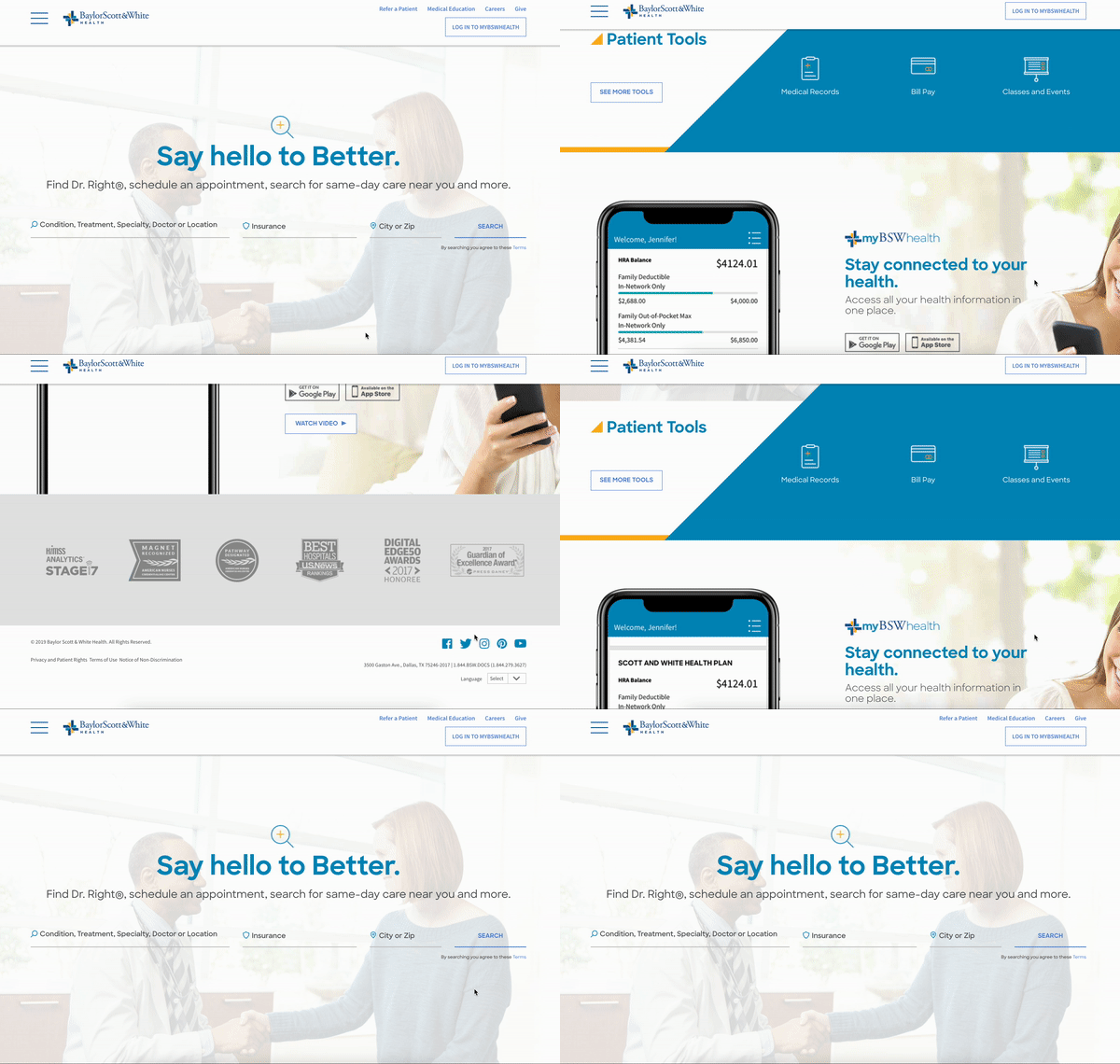
The previous homepage navigation experience.
Page typeObjectiveVariants
Nav & HomepageConversion2
Global searchNavigation vs. search2
Location detailPágina da unidadeInformation9
Provider detailPerfil do médicoInformation18
Service detailInformation53
Booking systemSistema de agendamentoWayfinding2

Internal benchmark: tools, system exploration, technology survey and stakeholder and team interviews, mapping every page type to a KPI.
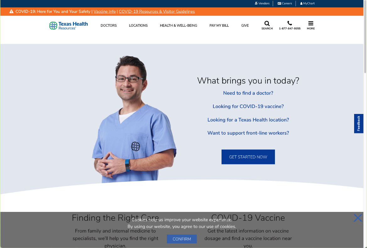
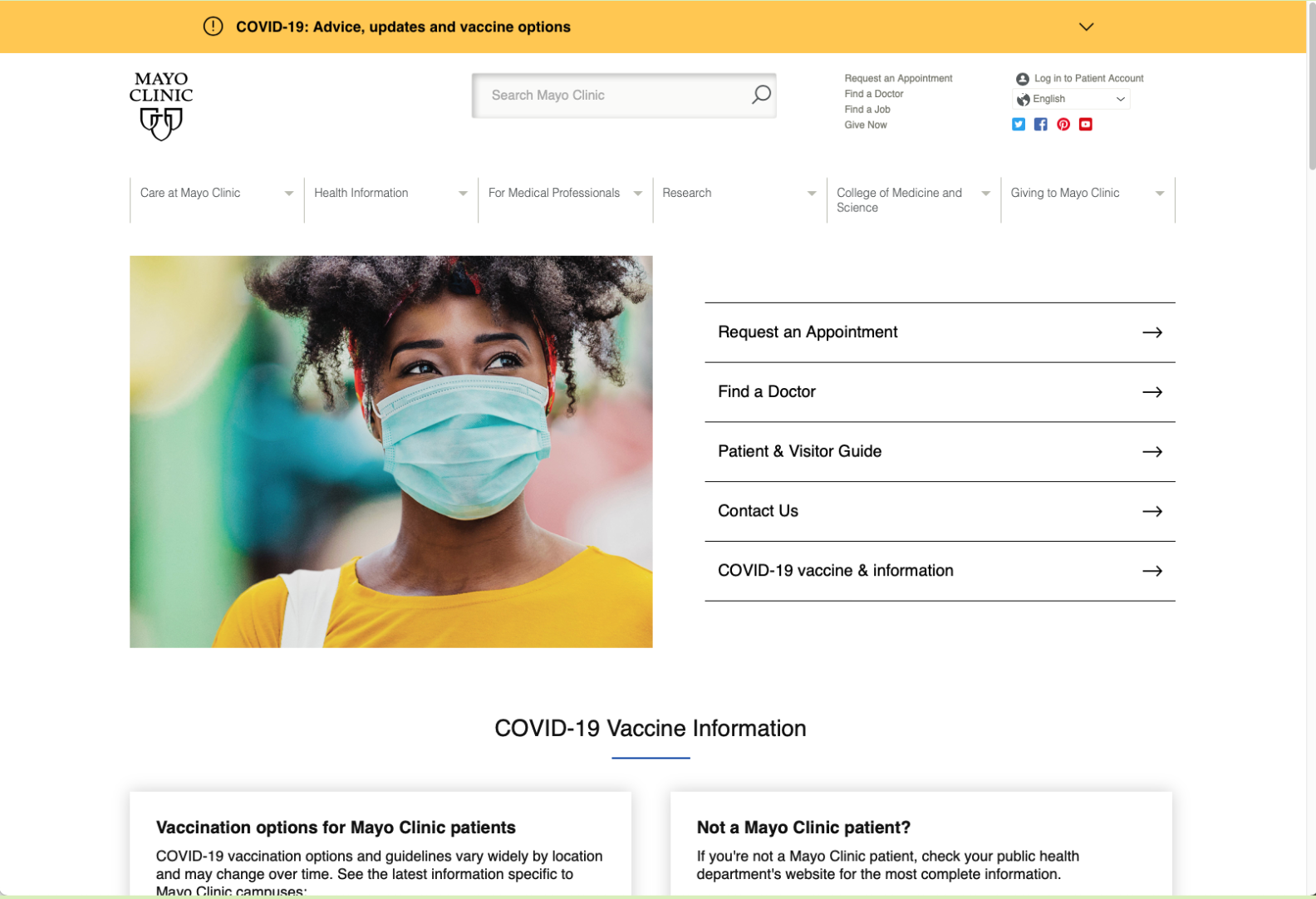
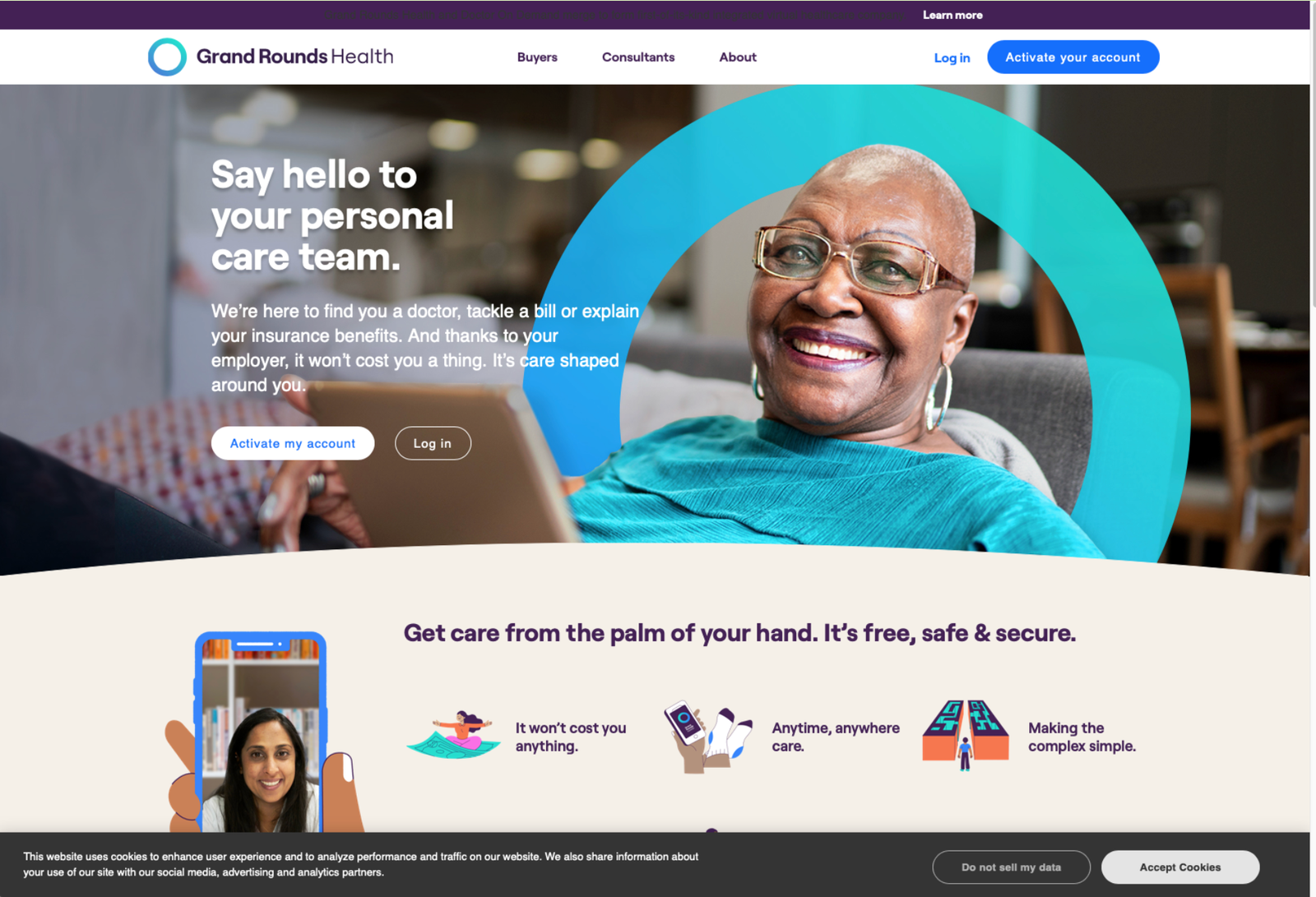
Local competitorFriendly appeal.
National competitorConvenient appeal.
Non-traditional competitorPersonal appeal.
28%switched or stopped seeing a provider after a poor digital experience
49%wish healthcare felt as smooth as Amazon, Netflix or Uber
26%wish it was easier to book appointments online
1,520US adults in the Forrester study we used as a benchmark
02 · Strategy

Aligning a vision before designing screens
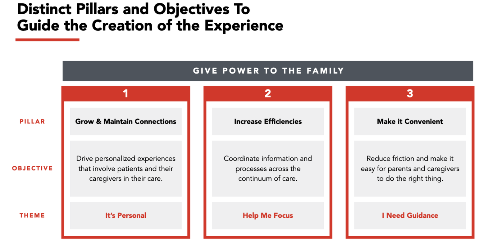
PillarsGrow and maintain connections, increase efficiencies, make it convenient.
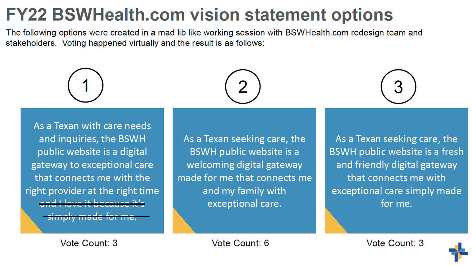
Vision statement workshopProduct, Engineering, Marketing and Growth voted on three options in a 30-minute session.
GoalsMore appointments online, local love, a better trip for search and SEO, the brand and a best-in-class experience.

The voted vision became the north star for every decision that followed:

“BSWHealth.com is a friendly and welcoming gateway that connects me and my family with exceptional care.”
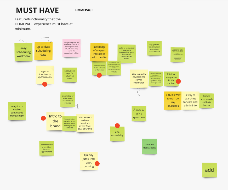
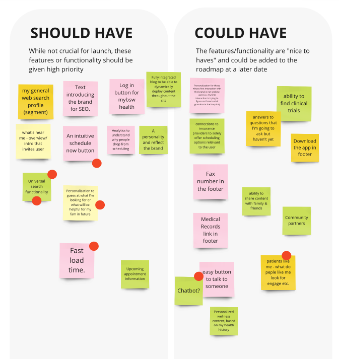
Must have
Should and could have
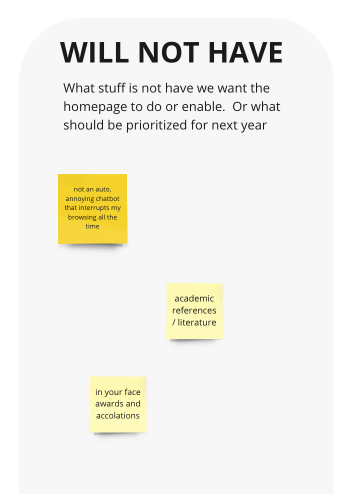
Will not have

Homepage requirements prioritized with MoSCoW, turned into a roadmap of effort and value.

03 · Converge

From key flows to a new visual language
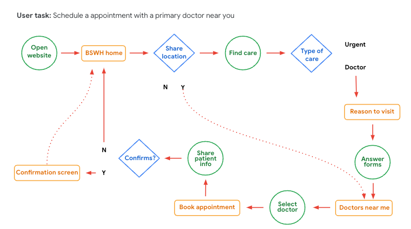
Scheduling flow“Book an appointment with a primary care doctor near you”, mapped end to end, including the urgent-care branch.
Architecture revampNova arquiteturaKey flows, challenges and pain points first; then sketches, low-fi and prototypes; then iterative design, testing and implementation.
The brand challengeMarketing and Product were updating a brand seen as out of date. The new direction had to feel fresh, friendly and welcoming, in line with the vision statement.
FromTo
Angular elementsRounded elements
High-contrast colour tonesNeutral and pastel tones
Flat modelsDepth: gradients and shadows
Static componentsMicro-interactions
Impersonal contentEmbracing contentConteúdo acolhedor

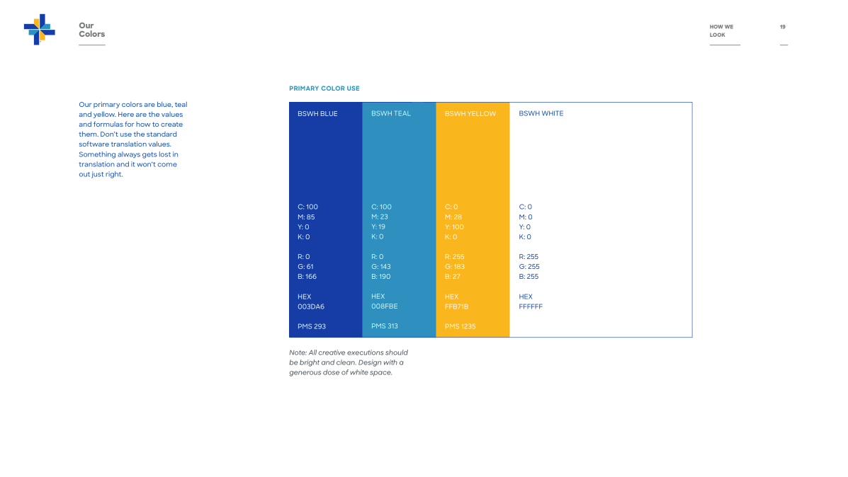
The previous brand guidelines: the starting point for the “shapeshift”.

04 · Design system04 · Design system

A library built from atoms to modules in 5 sprintsUma biblioteca construída de átomos a módulos em 5 sprints

The pages needed a system before they could scale across 48 hospitals and 7,800 physicians. The library was built in five sprints alongside the key flows, from foundations up to full modules, so every new page was assembled rather than drawn from scratch.As páginas precisavam de um sistema antes de escalar para 48 hospitais e 7.800 médicos. A biblioteca foi construída em cinco sprints junto com os fluxos principais, das fundações até módulos completos, para que cada nova página fosse montada e não desenhada do zero.

1FoundationsFundações

Grid for desktop, tablet and mobile · type scales · colour stylesGrid para desktop, tablet e mobile · escalas tipográficas · cores

Sprint 1
2ElementsElementos

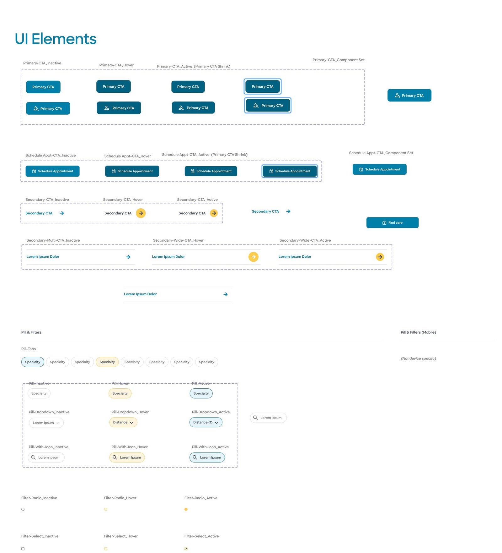
CTAs, pills, filters and form inputs in every state · focus statesCTAs, pills, filtros e inputs em todos os estados · estados de foco

Sprint 1–2
3PatternsPadrões

Navigation library, announcement bar, footer, imagery ratios, background system, motion notesBiblioteca de navegação, barra de avisos, rodapé, proporções de imagem, fundos, notas de motion

Sprint 2–3
4ModulesMódulos

50/50, carousels, galleries, FAQ, featured bios, virtual care, contact and find-tool routing50/50, carrosséis, galerias, FAQ, bios em destaque, atendimento virtual, contato e roteamento das ferramentas de busca

Sprint 4–5
5PagesPáginas

Homepage, location detail and booking, assembled from the modules aboveHomepage, página da unidade e agendamento, montadas com os módulos acima

→ 05 · 06
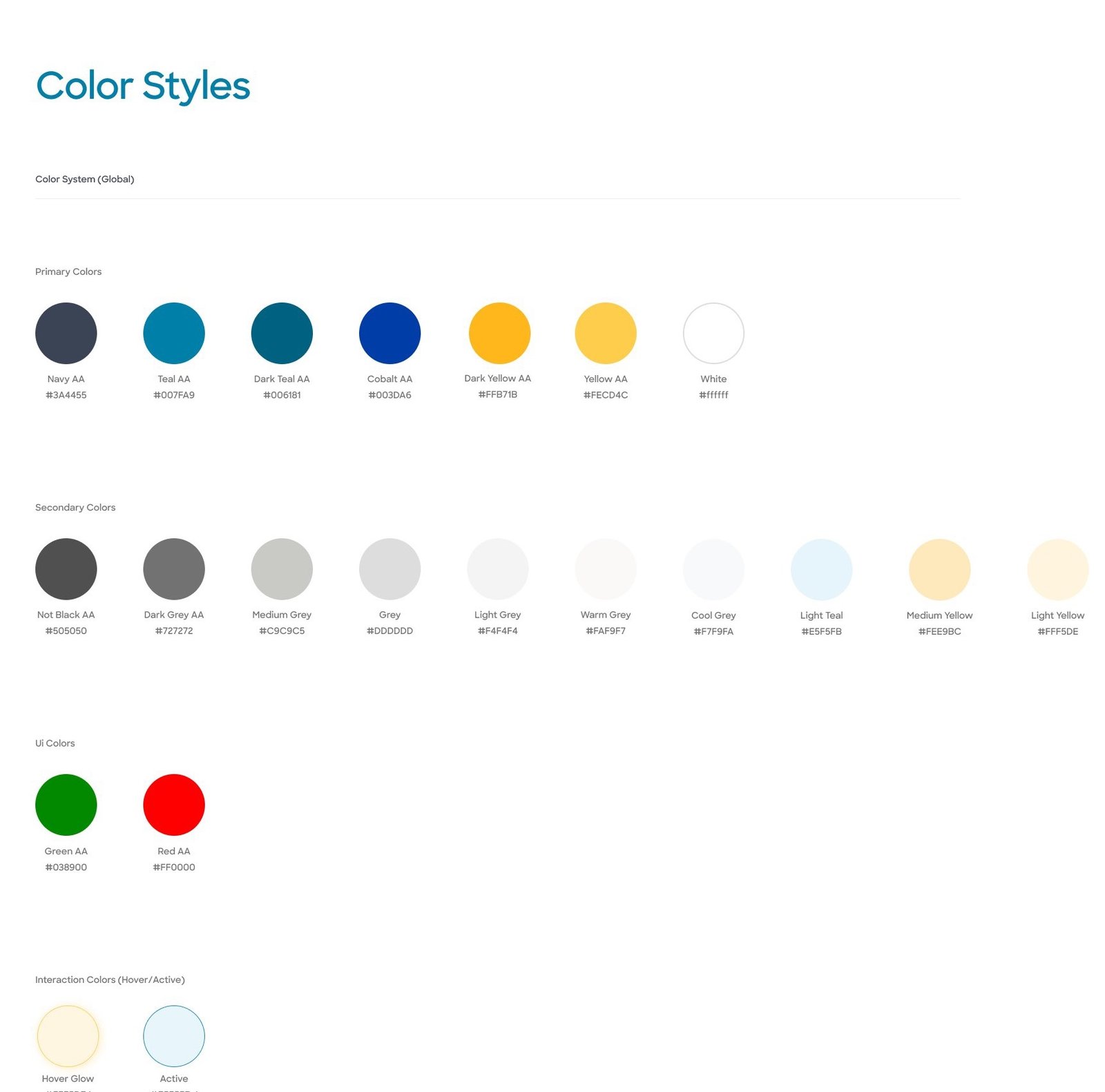
Colour stylesPrimary, secondary, UI and interaction colours.
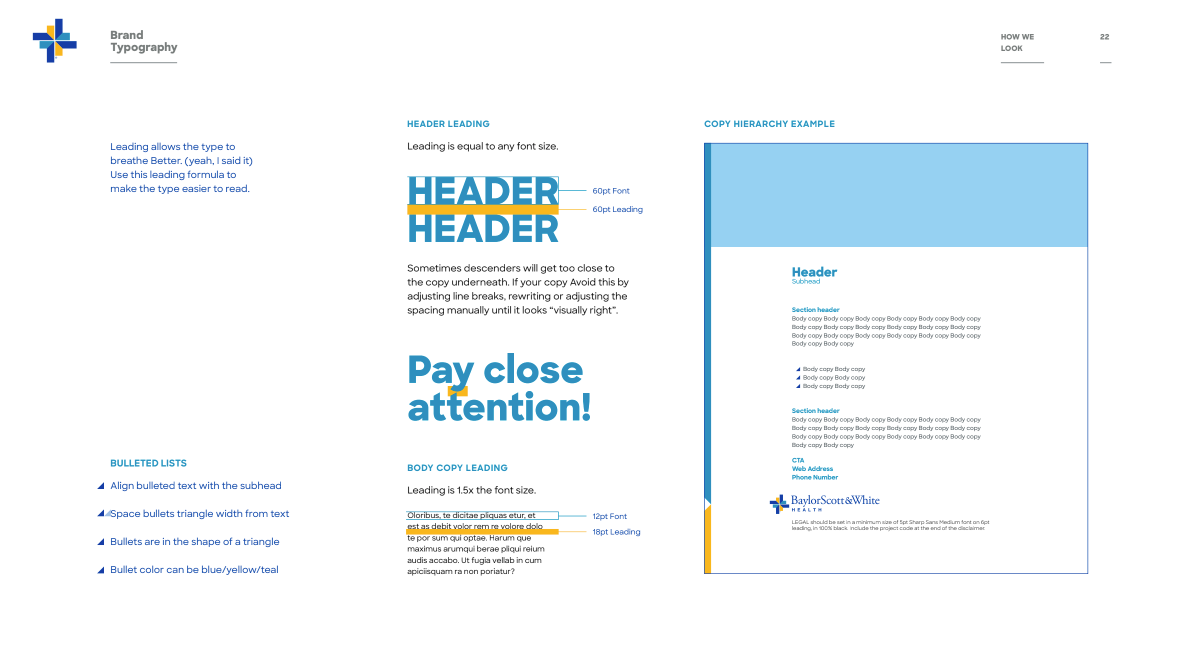
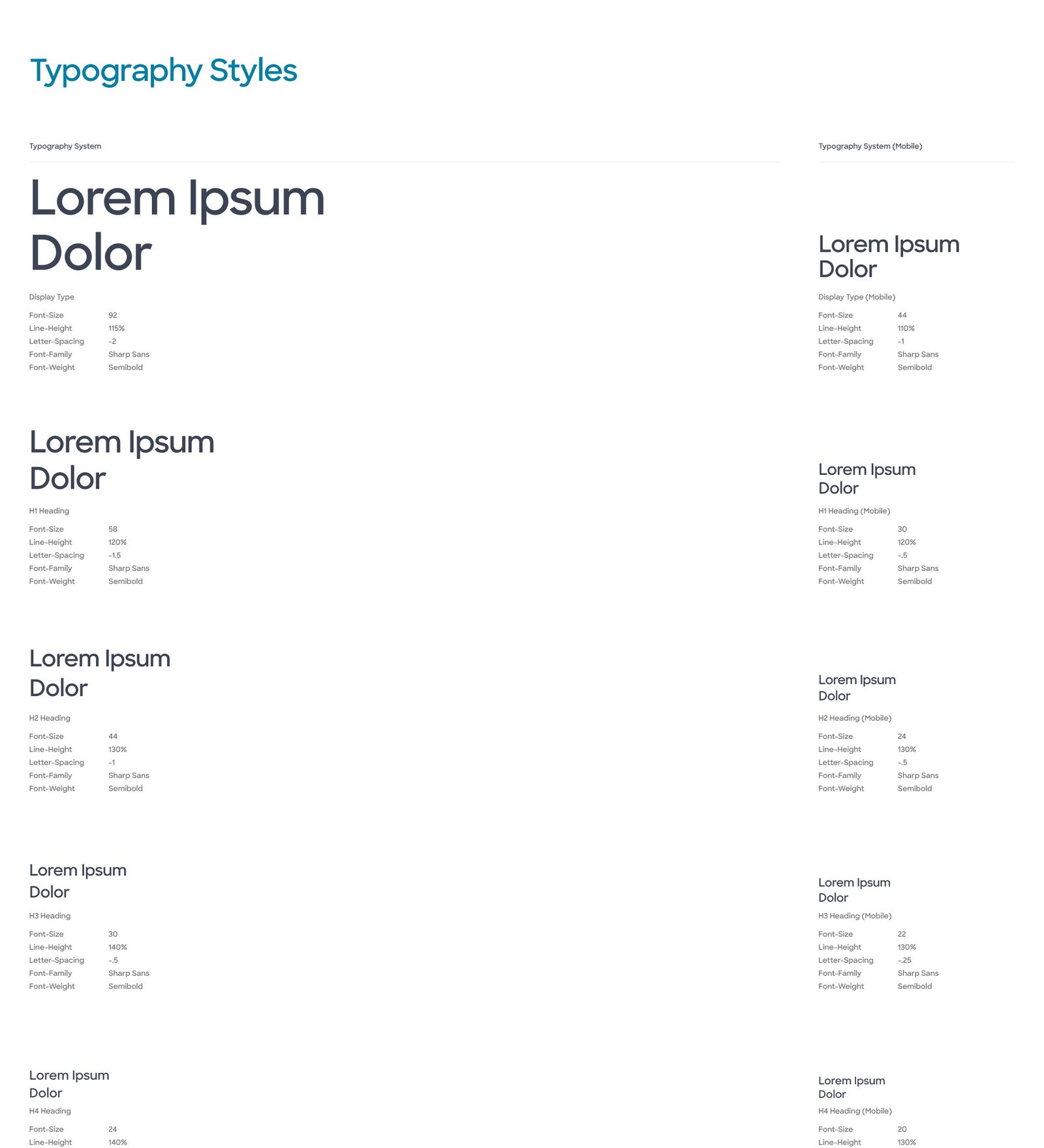
Type stylesDesktop and mobile scales.TipografiaEscalas tipográficas para desktop e mobile.
UI elementsCTAs, pills and filters in every state.
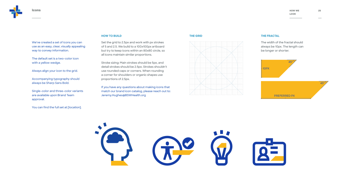
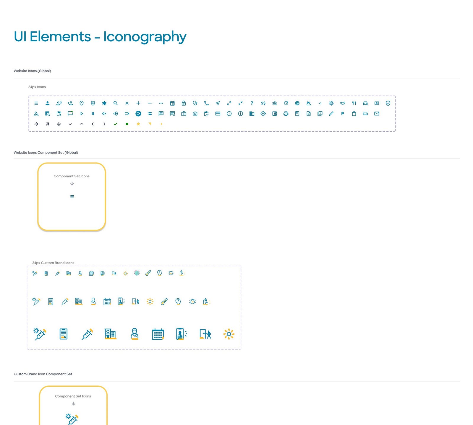
IconographyWebsite and custom brand icons.
Sprint 1Grid systems for desktop, tablet and mobile, typography, colour styles, UI elements and form inputs.
Sprint 2–3Imagery and aspect ratios, motion notes, focus states, background system, navigation library, announcement bar and footer.
Sprint 4–5Iconography and a modules library: 50/50, carousels, galleries, FAQ, featured bios, virtual care, contact and find-tool routing.
05 · Final design

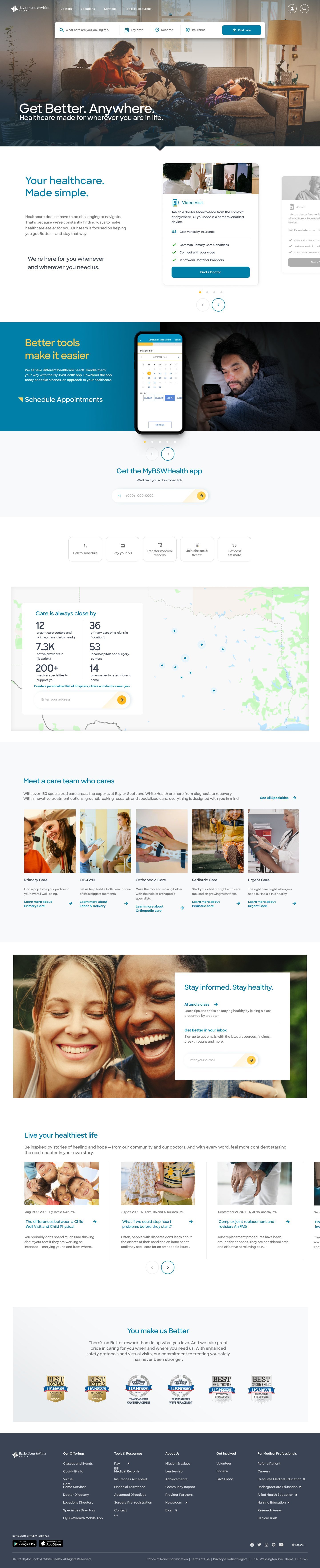
“Get better. Anywhere.”: the new homepagea nova homepage
bswhealth.com

Scroll inside the frame to see the full desktop page.Role dentro da moldura para ver a página desktop completa.

Mobile, full page.Mobile, página completa.
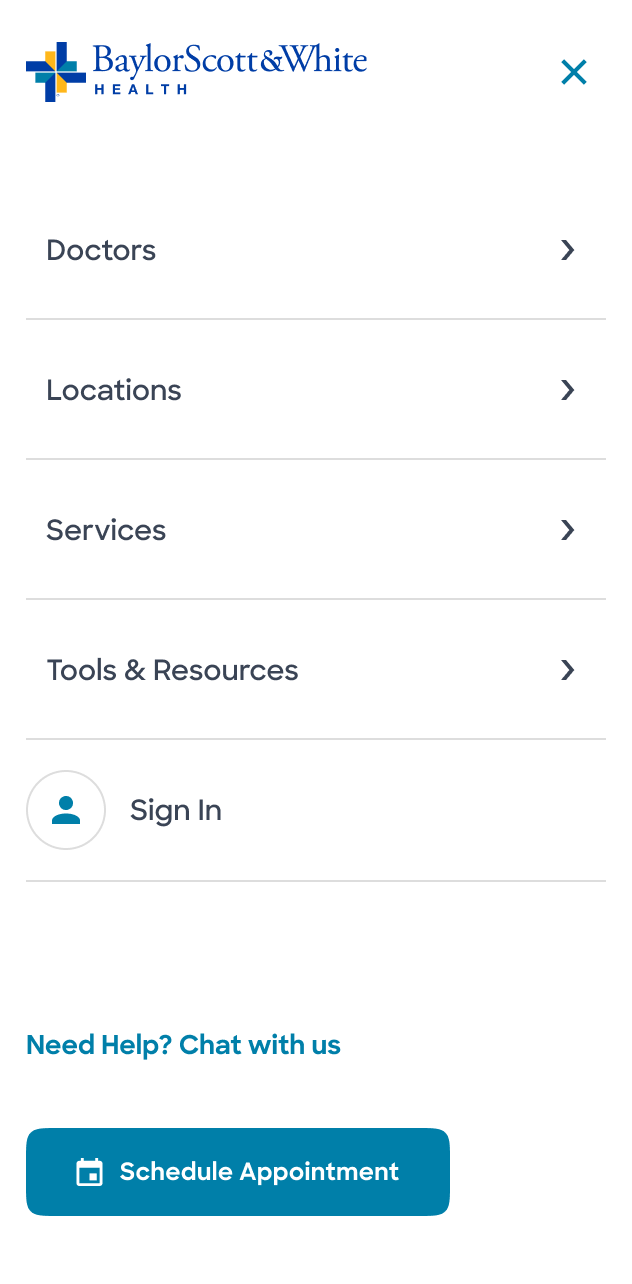
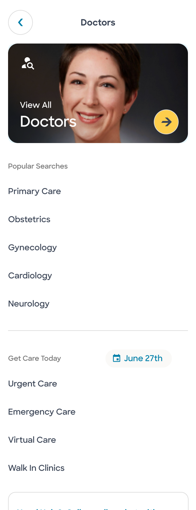
Search firstA single search bar for doctors, locations and services in the hero, with location and insurance filters, answering “What brings you in today?”
Care, made simpleCare options (video visit, primary and urgent care) as cards, followed by the app, the map of locations and specialties, all modular.
Warm, not clinicalRounded shapes, pastel backgrounds, real people and micro-interactions, following the “friendly and welcoming gateway” vision.
Menu
Find a doctor
Global search
Location on the map
06 · Location detail & booking06 · Página da unidade e agendamento

From finding a clinic to booking a visitDa busca pela clínica ao agendamento da consulta
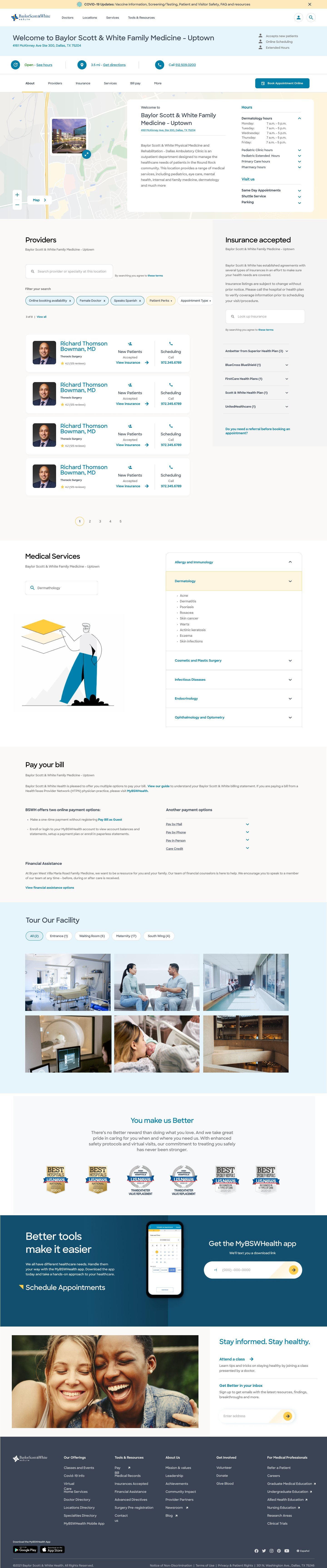
bswhealth.com
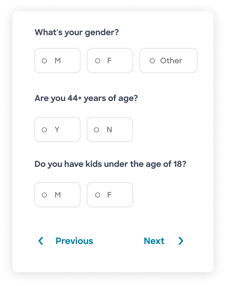
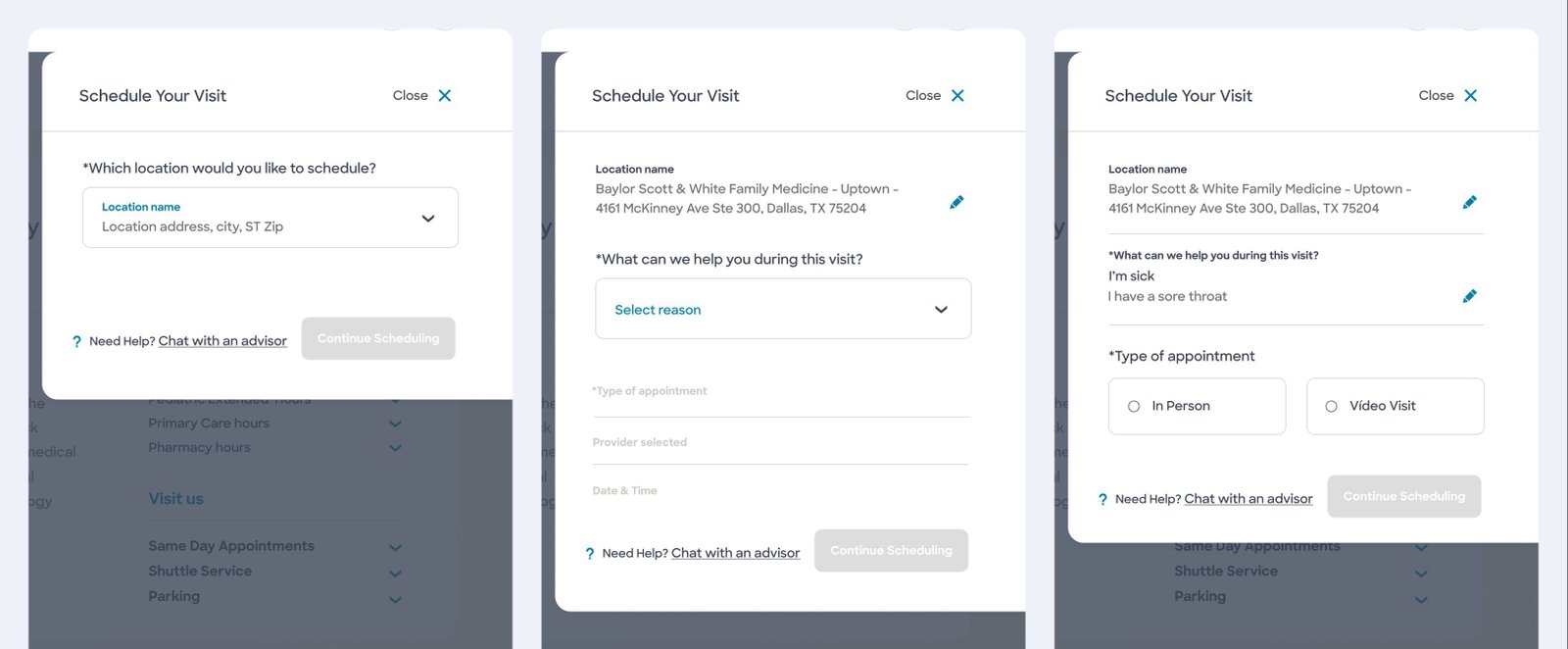
“Schedule your visit” drawerLocation, reason and type of visit (in person or video), one question at a time, without leaving the page.
One template, many casesThe same page adapts to primary care, multi-specialty and multi-location clinics, the 9 location variants mapped in discovery.
Booking in contextAgendamento no contextoScheduling opens as a side drawer, so patients keep the clinic, providers and insurance information in view.
Validation planLocation, provider and service pages measured with SUS in unmoderated tests; booking and homepage measured by time on task.Páginas de unidade, médico e serviço medidas com SUS em testes não moderados; agendamento e homepage medidos pelo tempo na tarefa.
07 · Validation07 · Validação

How each page was set to be measuredComo cada página seria medida

Validation planMetricMethod
Nav & homepageTime on taskModerated
Global searchNavigation vs. searchUnmoderated
Location, provider and service detailPáginas de unidade, médico e serviçoSUSUnmoderated
Booking systemSistema de agendamentoTime on taskUnmoderated
Moderated usability sessions · October 2021Testes de usabilidade moderados · outubro de 2021

I co-moderated remote think-aloud sessions on the prototype, with scenario tasks that follow a real patient path:Co-moderei sessões remotas de think-aloud com o protótipo, com tarefas em cenário que seguem a jornada real de um paciente:

1 · Urgent-care location pagePágina de pronto atendimentoNew to the area with cold symptoms: what would you do next?Recém-chegado na região, com sintomas de resfriado: qual seria o próximo passo?
2 · Condition pagePágina de condiçãoFrom a symptom search to the next step, with a content warning for a sensitive topic.Da busca por sintomas ao próximo passo, com aviso prévio por ser um tema sensível.
3 · Home searchBusca na homeFind primary care by date range and location from the main search bar.Encontrar atenção primária por período e local na busca principal.
4 · Location resultsResultados de unidadesFilters and “next available appointment”.Filtros e “próximo horário disponível”.
5 · Provider resultsResultados de médicosFilter, sort, “accepts new patients” and booking without leaving the page.Filtrar, ordenar, “aceita novos pacientes” e agendar sem sair da página.

Must-have features were validated with the PM and stakeholders before high fidelity.As funcionalidades essenciais foram validadas com o PM e stakeholders antes da alta fidelidade. Documentation lived in Confluence, with specs linked to Figma, and the design system grew as each new page went live.A documentação ficava no Confluence, com specs ligadas ao Figma, e o design system cresceu a cada nova página publicada.

Why the results aren’t herePor que os resultados não estão aqui

I was one of three partners on this project:Eu fui uma das três partes deste projeto:

1Baylor Scott & White HealthThe client, a healthcare network in Texas (USA).O cliente, uma rede de saúde no Texas (EUA).
2Bottle RocketStrategic product partner, based in Texas.Parceiro estratégico de produto, baseado no Texas.
3JüssiMy team: research, UX/UI and design system, on a 3-month contract.Meu time: pesquisa, UX/UI e design system, em um contrato de 3 meses.

With this many partners involved, everyone signed a strict NDA, so results data stayed with the client. This case shows the method and the design decisions, not the post-launch numbers.Com tantas partes envolvidas, todos assinaram um NDA rigoroso, então os dados de resultado ficaram com o cliente. Este case mostra o método e as decisões de design, não os números pós-lançamento.

See the live site at bswhealth.com →

Thanks for reading this far!